XBMC Eden Skinning Changes
Nathan Betzen
Confluence has been XBMC’s default skin for approximately 2 years now. In software dev terms, that makes it practically ancient. Fortunately, XBMC’s Jezz_X has been on the case to update Confluence so that it might better take advantage of a bushel bag of new tricks.
Some Background
On August 8th, 2008, an XBMC skinning group that came to be known as Team Razorfish presented a skin called MediaStream to the world. While most XBMC users would typically point to Aeon or an Aeon derivative as their favorite skin, it is undeniably true that MediaStream and its derivatives are the most downloaded skins among all the XBMC and XBMC derivative projects, because they’re the defaults.
When Plex broke off, that team made MediaStream_Redux their default. Similarly, when Team XBMC decided to move on from Project Mayhem 3 HD, we tasked our in-house skinner Jezz_X to make something awesome, and Jezz_X started with the MediaStream base.
On Oct 10, 2009, Team XBMC’s in-house skinner Jezz_X presented the Team with a first look at his, as yet unnamed, new skin. Obviously, we liked it a lot. Over the next month, we threw dozens of requests, bugs, and suggestions his way, and he handled them all brilliantly.
When it came time to name this new creation, the team agreed that we wanted something that was completely the opposite of Mayhem, like Serenity or Elegance or Fluidity. Many wanted to push the smooth, fluid way in which the skin seemed to breeze around. Additionally, XBMC 9.11 Camelot, the skin’s new home, marked the first time all of the many amazing qualities of XBMC were truly going to combine without a drop of Xbox input. And so “Confluence,” the flowing together of many streams, was adopted. XBMC Camelot was released with Confluence on December 24, 2009, just in time for Christmas, and the devs were already hard at work on Dharma.
Perhaps the greatest change from Camelot to Dharma was the shift from a hodge-podge DIY addon system to the integrated addon system we all know today. Such a system has been a real learning experience for the team, both in terms of maintaining a repository, handling breaking addons, and, of course, designing ways to display these addons in our skinning engine.
It became clear fairly early after the release of Dharma, and even before, that XBMC addons were going to be pretty popular, but the Dharma release barely addressed how to access these addons. At the time, the Team was pleased to be able to include them at all.
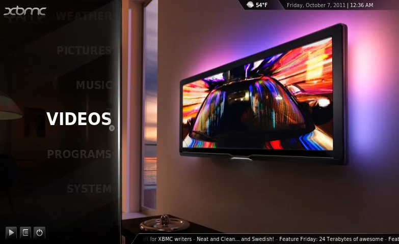
Aside from handling addons, the other major frustration of the Dharma Confluence skin was the way links to TV Shows and Movies were handled. People didn’t like having to click over to get to those links. Jezz_X had to include a method of displaying those crucial links on the main list, because it was in no way obvious that the links could be brought up through a simple click to the right.

The fact that I added movies is not especially clear.
XBMC Eden’s Home Screen
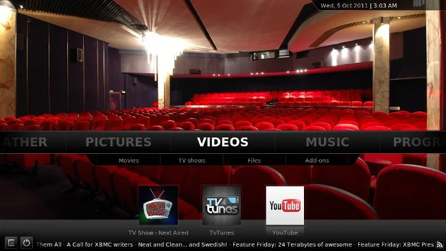
To resolve the issue, Jezz_X did one simple little thing that resolved both problems at once. He tilted the navigation bar horizontally.

As you can see, just about everything is visible now without clicking, and EVERYTHING has changed.
With this simple trick, Movies and TV Shows became automatically visible without requiring a single additional click. particularly useful addons could be accessed directly from the home page, and additional addons could be easily accessed through the visible “Addons” link. Jezz_X further confirms that, while Confluence limits skinners to a mere five favorite addons for Videos, five for Music, five for Pictures, etc. for a total of twenty visible addons on the home screen, the skinning engine allows for an enterprising skinner to devote the entire screen to addons, similar to the current Android and iOS browser methods of listing apps.
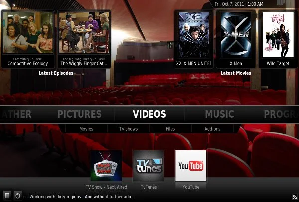
Finally, one of the most popular links on the home screen was the “recently added” link. Now, that link has been made mildly redundant by simply listing all recently added content in the space above the bar on the screen.

Four recently added episodes and five recently added movies are all visible now.
For those of you concerned, these changes haven’t upset your preferences too much. If you prefer to keep TV Shows or Movies in the main menu, Confluence naturally has options to pull those items out of the Videos submenu and onto the main menu.
Other Eden Visual Changes
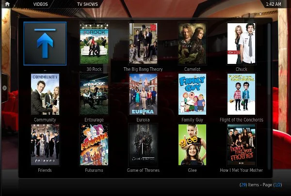
With luck, most of the remaining changes to Confluence will be so clean and natural that a typical user won’t even notice them. Display styles have been made more uniform. Hidden options were either removed or made visible. The side menu in the media window is more visibly accessible. 15 thumbnails, rather than 10, are now visible at a time. Flags have been updated. Dozens of similar changes have occurred that won’t be immediately obvious, but will all make navigation just a little easier.

The Eden Library view wastes much less space and is far easier to navigate.
The On Screen Display (OSD)
Finally, we turn to the OSD. Before detailing it though, it may be worth going back and looking at one last story. As you know by now, about a month after Dharma was released, Team XBMC was proud to announce XBMC for iOS. At the time, this made perfect sense for the Apple TV 2. An XBMC box for sub-$100? Sign me up! Unfortunately, it made far less sense for the iPad and, even worse, the iPhone. Confluence was designed with a giant TV and a remote control in mind. Touchscreen support was the furthest thing from anyone’s mind when it was developed back in autumn 2009.
Fortunately, thanks to the generous contributions of our fans, the Foundation was able to provide Jezz_X with an iPad to turn Confluence into a lean, mean, touchscreen… skin.
We’ll discuss this in greater depth in a later article, but for now the take away is that Confluence is one of the rare skins that is navigable both by remote and by touch. Which brings us to the OSD.
As you should see, the menu obscures much less of the video than it did in Dharma. It is now possible to return to the menu while the video is still playing by hitting the X in the top right corner. Knowledge of special buttons is no longer required. Also, you can use your mouse or finger to seek using the slider.
Overall, the view is simpler and less invasive, like every skin should be.
Conclusion
While there are many more changes to Confluence than have been highlighted here, it seems reasonable to stop now, before we go overboard in discussing them. Instead, if you are especially eager to check them out, feel free to download a nightly. Be prepared to bump into a few bugs, if you do. Otherwise, keep an eye out for release announcements in the near future and keep following the blog as we look at other big changes to XBMC Eden.

